Grid
Introduction
Our layout grid ensures consistency, alignment, and visual rhythm across all digital touchpoints. It provides a solid foundation for responsive design, clear spacing, and predictable layouts.
Main content area
- Max width: 1440px
- Margins: Adjust based on viewport size to maintain readability and balance
Spacing system
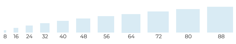
All spacing follows 8px increments to maintain consistent visual rhythm.
- Recommended increments: 8px / 16px / 24px / 32px / 40px / 48px / 56px …
- Applies to padding, margins, and spacing between elements.
- Mobile exception: If an 8px increment is too large, half increments (4px) can be used to maintain proportional spacing.
Grid by breakpoint
Breakpoint | Width | Margins | Gutters | Column Width |
|---|---|---|---|---|
Large Desktop | 1536px+ | Flexible | 24px | 98px |
Medium Desktop | 1535px – 1200px | Flexible | 24px | 98px |
Tablet | 1199px – 600px | 16px | 16px | Flexible |
Mobile | 599px – 320px | 16px | 8px | Flexible |
Guidelines / dos & don’ts
- Do: Align all elements to the 12-column grid.
- Do: Use consistent 8px increments for padding and margins.
- Don’t: Use spacing outside 8px increments.
- Don’t: Ignore margin rules across breakpoints.