Typography
Typography is a core part of the Advocate visual identity. Using our chosen typefaces with the correct colors and weights ensures consistency, legibility, and a unified voice across all communication channels. Good typography isn’t just about looks; it also improves readability, accessibility, and user trust.
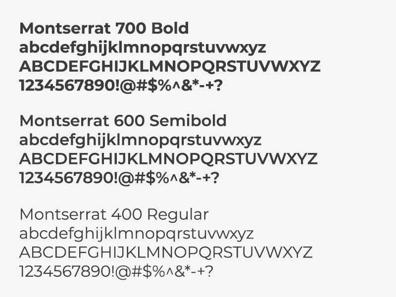
Typeface
Our digital properties use Montserrat as the primary font. It is flexible, modern, and highly legible, making it suitable for both short headlines and longer-form content. When Montserrat is not available, system fallbacks are used to preserve readability.
Themes & font scales
We maintain two main type scales that align with our brand themes:
- Corporate Scale - Uses larger, more pronounced text across all content. This scale creates a bold, confident look and ensures components stand out.
- Consumer Scale - Uses a slightly smaller font size to support longer reading. This scale keeps content scannable and comfortable for consumers while maintaining clarity.
Hierarchy & scale
Typography should always signal levels of importance. A clear hierarchy improves readability, supports accessibility, and reinforces SEO best practices.
- Heading order: Use heading tags (h1 through h6) in order of importance. H1 is the most important, H6 the least.
- One H1 per page: Each page should include only one H1 tag. This should represent the page’s primary topic or focus keyword, which also strengthens SEO performance.
- Scanning: Consistent use of headings allows users to quickly locate key points and understand the structure of content at a glance.
- Visual distinction: Headings, subheadings, body text, and captions should each be visually distinct, aligned with the selected theme (Corporate or Consumer).
A well-applied hierarchy ensures users can process content efficiently without confusion.
Accessibility & readability
Typography should work for as many people as possible. Always:
- Maintain sufficient contrast between text and background
- Avoid using color alone to convey meaning
- Ensure text is resizable without loss of clarity
- Use font sizes that are large enough to be readable on all devices, with body text generally no smaller than 16px (or equivalent in rem/em units)
- Provide meaningful link text rather than “click here”
- Support screen readers with proper semantic heading order